Visualizing Distributions
Visualizing Distributions
There are some classical visualization tools to explore distributions, both univariate (one variable) and multivariate (more than one variable). Histograms are commonly used for univariate distributions and boxplots are a historical graphic for multivariate visualization.
Load some data
library(tidyverse)## Warning: package 'readr' was built under R version 4.1.1library(ggformula)
library(palmerpenguins)
theme_set(theme_bw(base_size = 16))
head(penguins)## # A tibble: 6 × 8
## species island bill_length_mm bill_depth_mm flipper_length_… body_mass_g sex
## <fct> <fct> <dbl> <dbl> <int> <int> <fct>
## 1 Adelie Torge… 39.1 18.7 181 3750 male
## 2 Adelie Torge… 39.5 17.4 186 3800 fema…
## 3 Adelie Torge… 40.3 18 195 3250 fema…
## 4 Adelie Torge… NA NA NA NA <NA>
## 5 Adelie Torge… 36.7 19.3 193 3450 fema…
## 6 Adelie Torge… 39.3 20.6 190 3650 male
## # … with 1 more variable: year <int>Here is a histogram exploring the body mass of the penguins.
gf_histogram(~ body_mass_g, data = penguins, color = 'black') %>%
  gf_labs(x = "Body Mass (in grams)")
## Warning: Removed 2 rows containing non-finite values (stat_bin).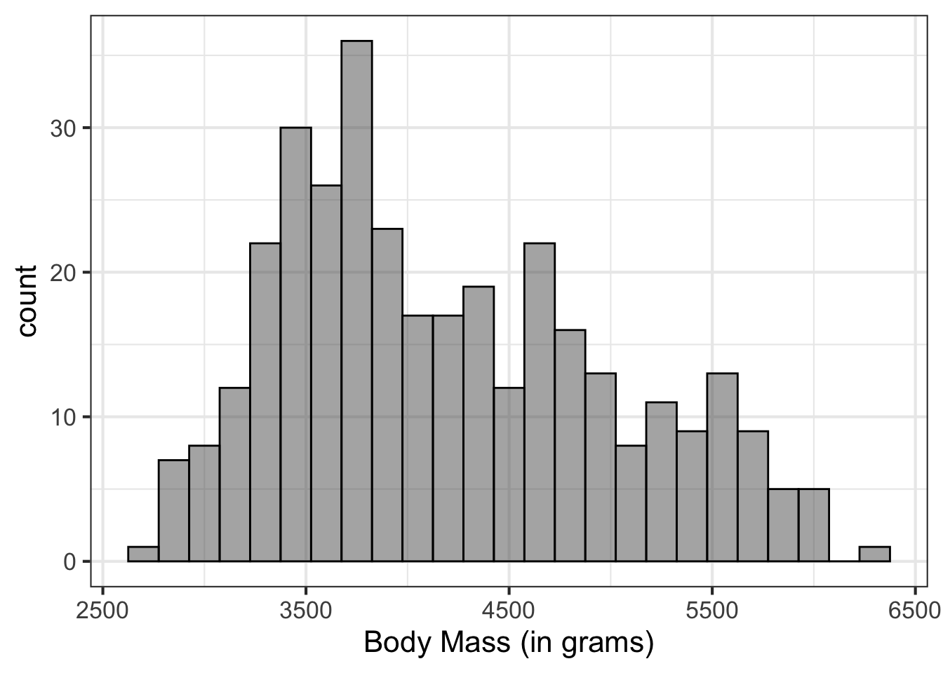
What are the weaknesses of the histogram?
gf_histogram(~ body_mass_g, data = penguins, color = 'black',
             binwidth = 50) %>%
  gf_labs(x = "Body Mass (in grams)")
## Warning: Removed 2 rows containing non-finite values (stat_bin).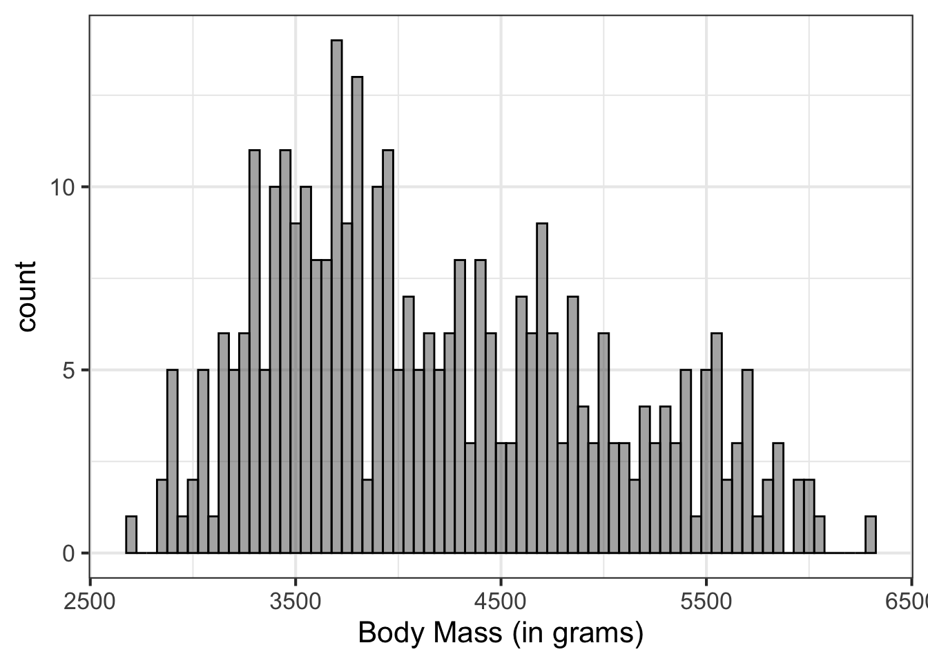
An alternative is the density curve which uses kernel density estimation to get a curve. The details of the kernel density estimation isn’t overly important, and it is possible to change the estimation. The default estimation works pretty well however.
gf_density(~ body_mass_g, data = penguins) %>%
  gf_labs(x = "Body Mass (in grams)")
## Warning: Removed 2 rows containing non-finite values (stat_density).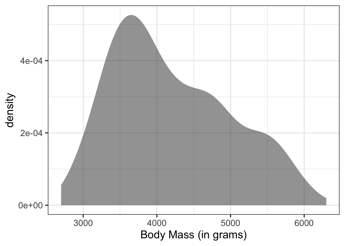
Multivariate Thinking
In general, exploring univariate distributions are important, but in most situations, it is also important to explore these distributions in a multivariate framework. This means, exploring the distribution of the outcome attribute by other attributes.
** Insert interactive components**
The boxplot is one way to do this.
gf_boxplot(@@ ~ body_mass_g, data = penguins) %>%
  gf_labs(x = "Body Mass (in grams)",
          y = "$$")
Boxplots are simple representations, but since they are only based on 5 numbers, can be too simple.
Density plots for each group could be explored, but can get difficult to interpret with many groups. Violin plots (or a related sina plot) are the solution.
gf_violin(@@ ~ body_mass_g, data = penguins, fill = 'gray80') %>%
  gf_labs(x = "Body Mass (in grams)",
          y = "$$")
gf_violin(@@ ~ body_mass_g, data = penguins, fill = 'gray80',
draw_quantiles = c(0.1, 0.5, 0.9)) %>%
gf_labs(x = "Body Mass (in grams)",
y = "$$")library(ggforce)
gf_sina(body_mass_g ~ @@, data = penguins) %>%
gf_labs(y = "Body Mass (in grams)",
x = "$$") %>%
gf_refine(coord_flip())gf_violin(body_mass_g ~ species, data = penguins) %>%
gf_sina(body_mass_g ~ species, data = penguins) %>%
gf_labs(y = "Body Mass (in grams)",
x = "$$") %>%
gf_refine(coord_flip())